
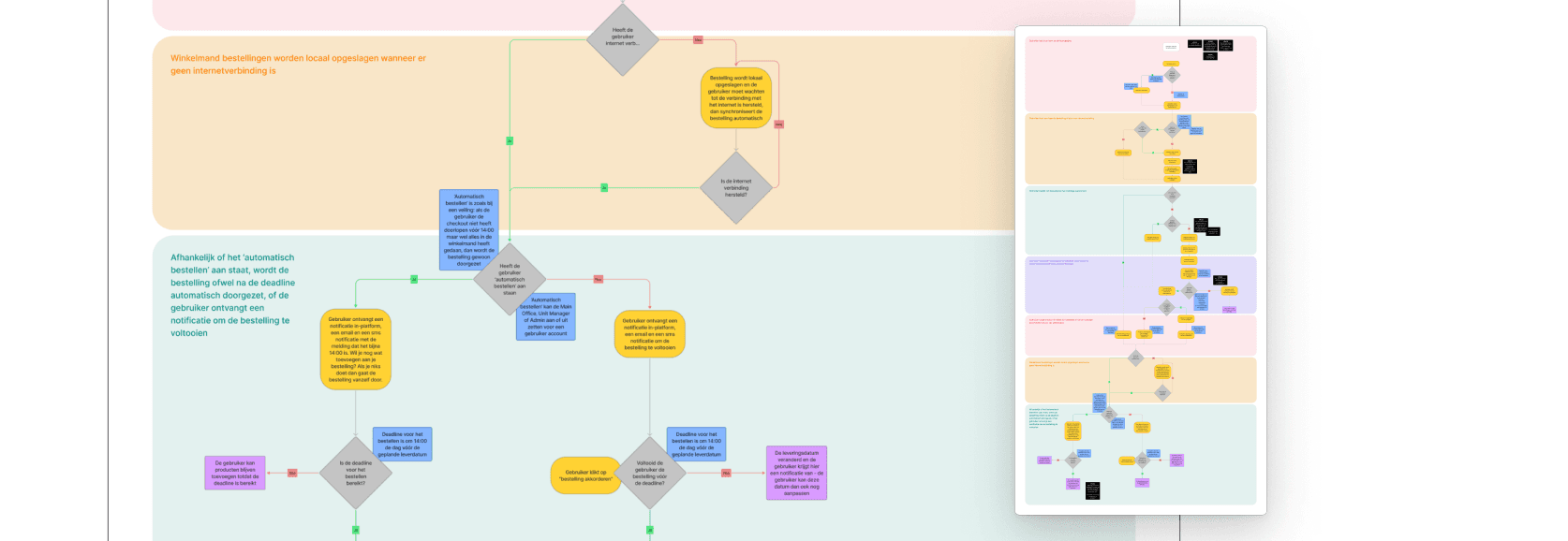
The Real Complexity Was Structural, Not Visual
Before a single wireframe was drawn, I mapped the existing user flows end to end. Not to document what was there, but to understand where the complexity lived, and whether the friction users experienced was a design problem, a systems problem, or both.
It was both. The platform's personalised data, unique pricing, tailored assortments, individual promotions, was surfacing in ways that created confusion rather than confidence. Users weren't struggling because the information was wrong. They were struggling because the structure made it hard to trust what they were seeing.
This is a distinction that matters. A visual redesign wouldn't have solved it. The architecture needed rethinking first.
Two Designers, One Standard
I shared ownership of this project with one UX/UI design colleague. We worked in tandem throughout, not dividing the work, but doing it together, deliberately challenging each other's ideas before committing to them. On a platform this complex, a single perspective is a liability. The best solutions came from the tension between two informed points of view.
Benchmarking comparable B2B platforms helped us identify familiar interaction models that could ease adoption for existing users, people who had built their daily workflows around the old system and would resist change for its own sake. The goal was never to impress them with something new. It was to give them something better that felt immediately familiar.
Testing With the People Closest to the Users
Low-fidelity wireframes focused on structure and hierarchy before any visual decisions were made. As the logic and dependencies became clearer, we moved into high-fidelity, essential in a platform where personalised product data and pricing are central to every screen, and generic placeholder content would have hidden the real usability questions.
Interactive prototypes were tested with the client team, who collectively represented the breadth of the user base. This gave us feedback that was grounded in real workflows, not assumptions, and it meant the final designs arrived at approval with genuine stakeholder confidence behind them.

The Outcome
The resulting designs delivered a B2B platform that could adapt dynamically to each individual user's context while maintaining a consistent, brand-aligned experience across every touchpoint. The technical complexity, hundreds of variations in pricing, assortment and promotions, became invisible to the user. Which is exactly where it belongs.
The project is currently in its final approval phase before entering development.
What This Taught Me
Designing for a platform where every user is different is not primarily a visual challenge. It's a systems challenge dressed in a UX brief. The skill is in holding that complexity clearly in your thinking, so that the person using the platform never has to.
